 Hey sudkamp! this is my last piece.
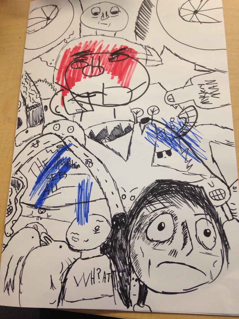
the whole point of this piece is to fill up all the negative space with little doodle or something. i really liked doing this and it was really fun! the blind portrait of Kylie is still on there and i just tried to fill up all the space. some stuff is lazier than others. There are 1 or 2 spaces where i ran out of time. i used various black markers and the blue and red markers for the portrait of kylie. hey also you should know that not only are you super good at art, you're very good at teaching it. my style and ability really sky rocketed because of this class and your advice and i really just want to say thank you. you are also now like one of my favorite teachers at this school. youre so cool and very easy to talk to. AND you let me express myself a lot through my pieces, so i want to thank you for that as well. well, overall i loved your class and youre super cool and i hope you get your internet at home! you dont really need cable because like netflix and hulu BUT THATS UP TO YOU. take care! bobby cnare
0 Comments
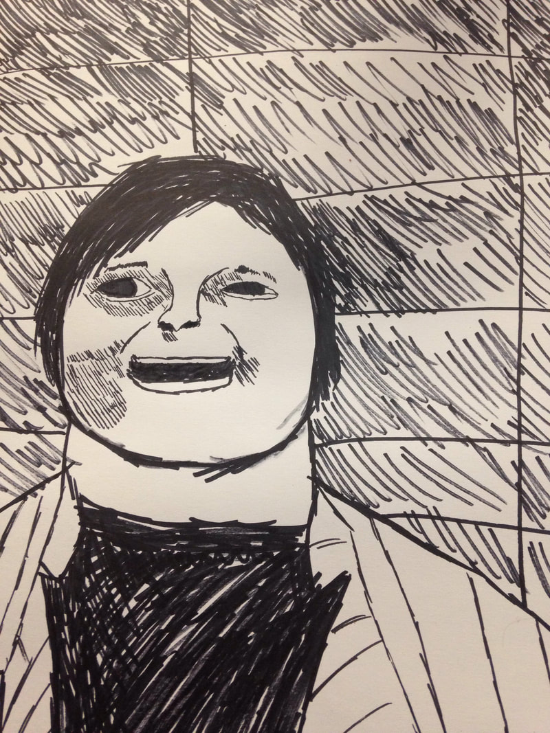   well. i know what you're thinking. "bobby! this isnt what your supposed to do with a portrait!"
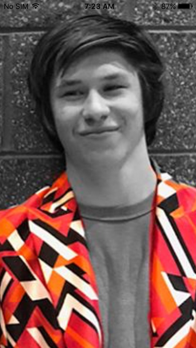
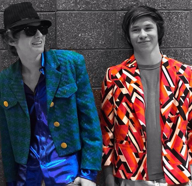
but here's the thing. my drawing skills have definitely gotten better since I started taking this class. But I just couldn't get Brayden right! SO i decided to have fun with it. Make it a "Bobby Cnare" piece as fast as possible. So, in one class period, I made this portrait. its good right? whadda mean no? 1. This is one of my best friends, Brayden. He's the guitarist in my band, (Im the drummer). We dressed up in 80's clothes to go see the Incredibles 2. Here is a picture of that. really cool guy! love that man. 2. I used sharpies because i normally get the most of my style with markers. I thought it was also really funny to do the hatching on his face. i dont know why 3. Well, i almost basically did a blind contour, except I was looking at the paper maybe like every 5 seconds. I raced through this, really making the parts that make up his face stand out; which i actually enjoy making a lot more! because once you know who it is and what they look like, it's almost like an insult but not really! 4. I find it very successful, everyone who i know who knows brayden knew who it was at like record speed. Next time, maybe i will try to make an actual portrait but i had a lot of fun with this!   1. I tried to make my piece show lots of line by trying to have a basic idea, but making it as intricate as possible.
2. I think the piece is simple, but states a lot. I believe it's very minimalistic, actually! I would do better on the cutting of the block. Behind the scenes was pretty ugly. But at least I didn't cut myself! well i did actually run the entire thing over my hand BUT NO BLOOD! so yeah. This is the last sentence.   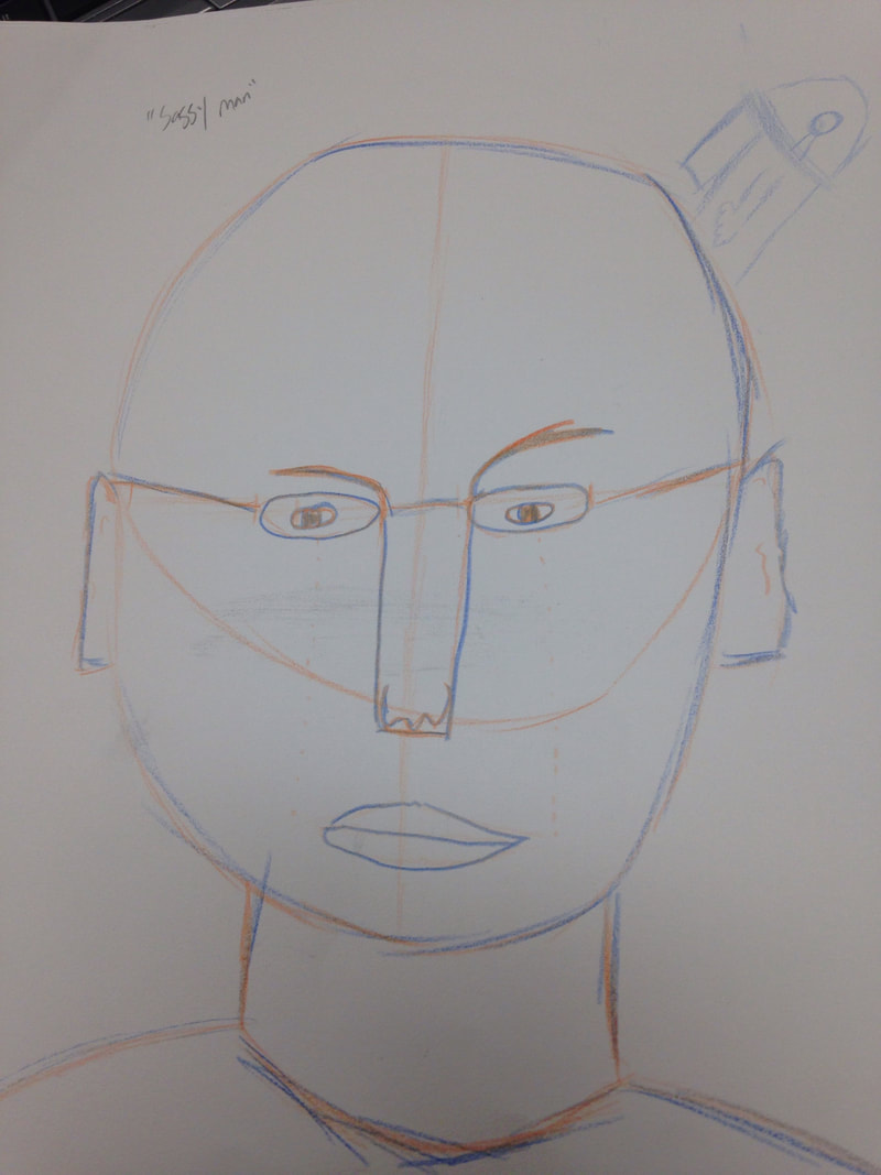  1. Definitely the proportions warm up. I did not realize how much I inaccurately drew faces and stuff.
2. I DIDNT KNOW HOW BIG FOREHEADS ACTUALLY WERE, MAN. They are so big take up so much of a face. It's actually very interesting. 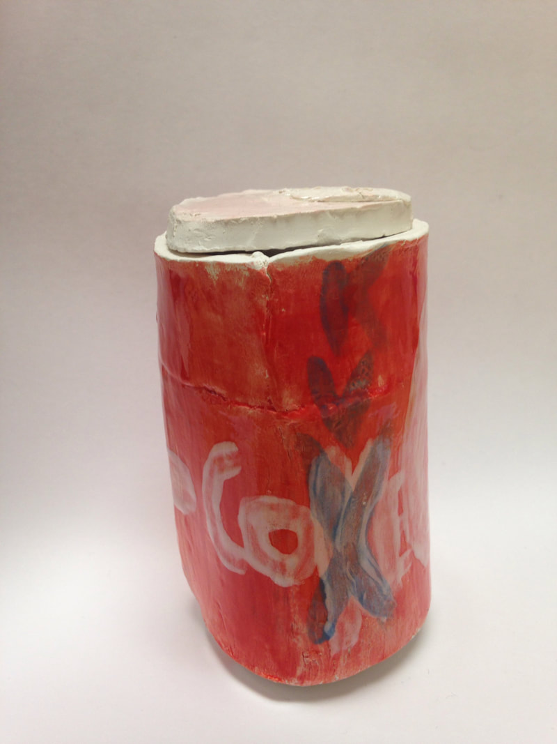 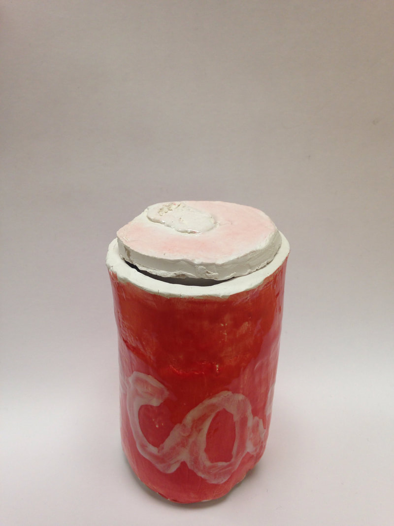 1. I've painted my sculpture and glazed over it. I also didn't like the way I did my K, so as a joke, I crossed it out and put a new one on.
2. I really think the most successful part of my piece is actually the color I put on it! It is VERY similar to the way coke cans are actually colored. 3. I think I would've made the white a bit more bold and I would've hid the crease a bit more cleverly. 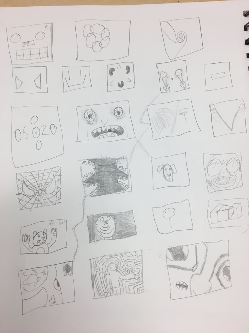 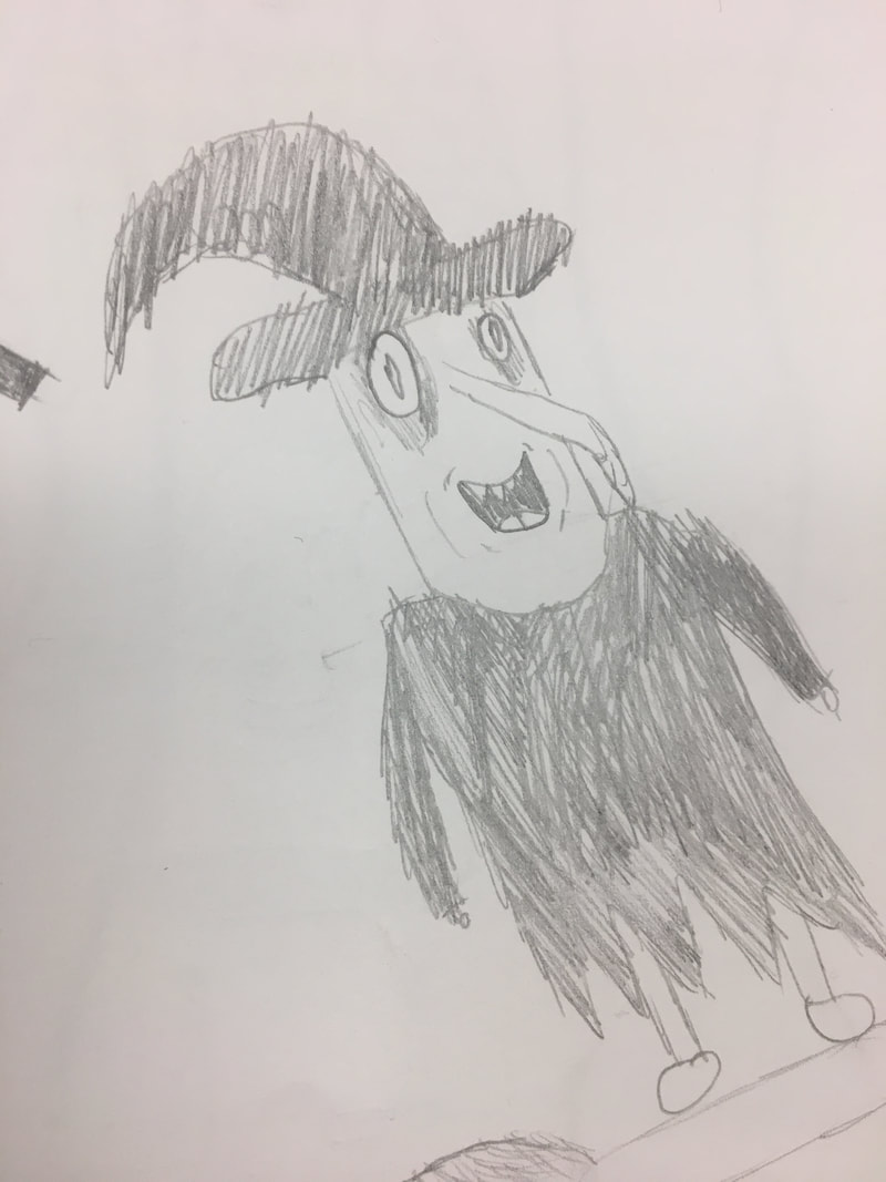
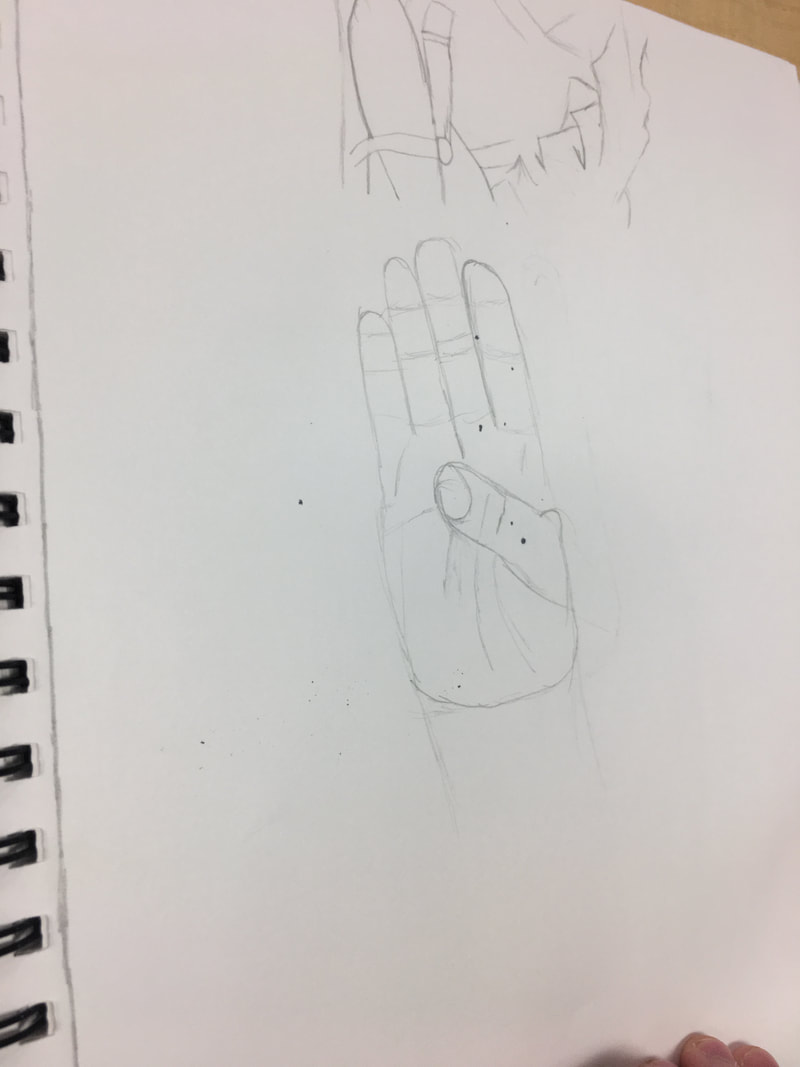
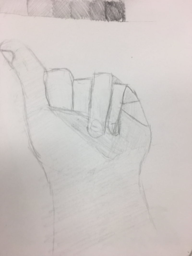
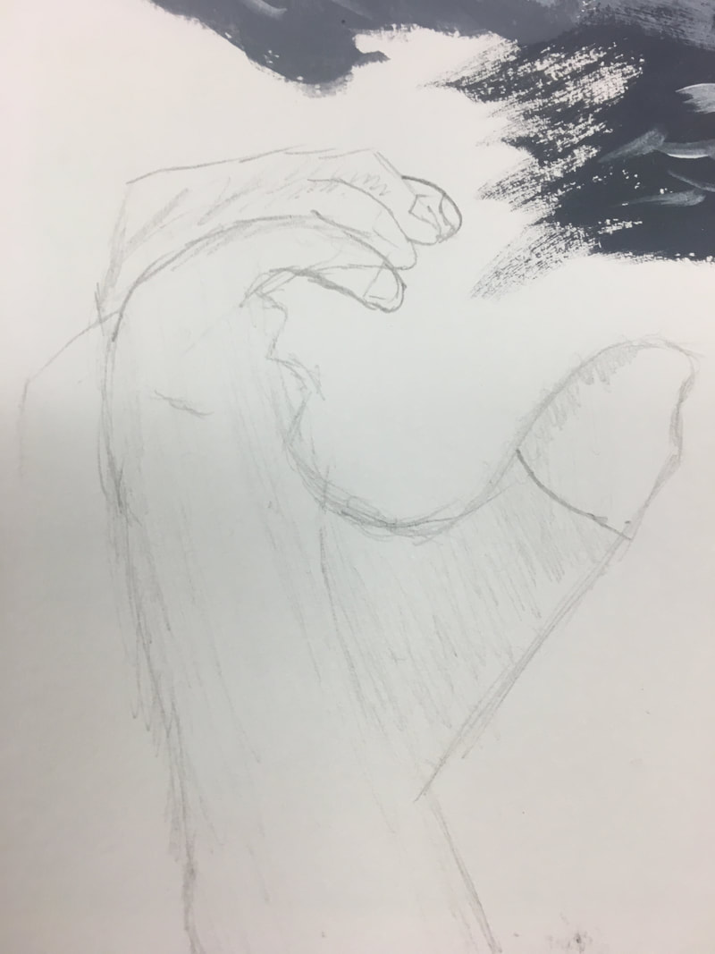
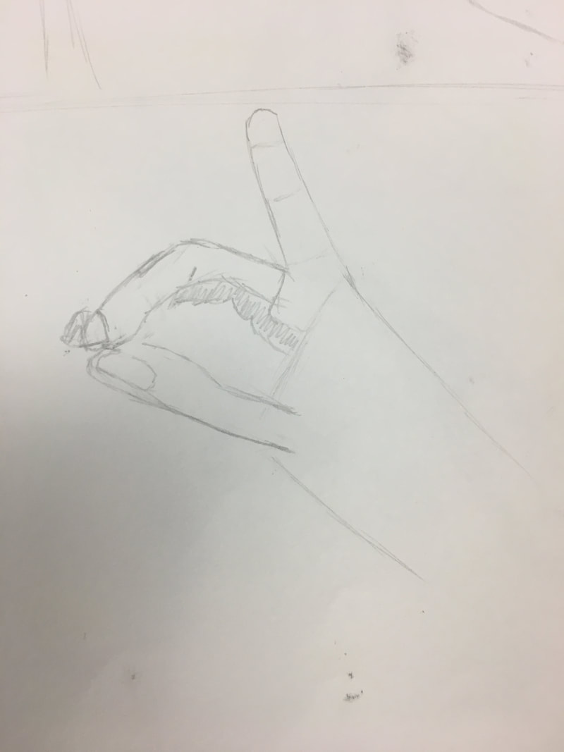
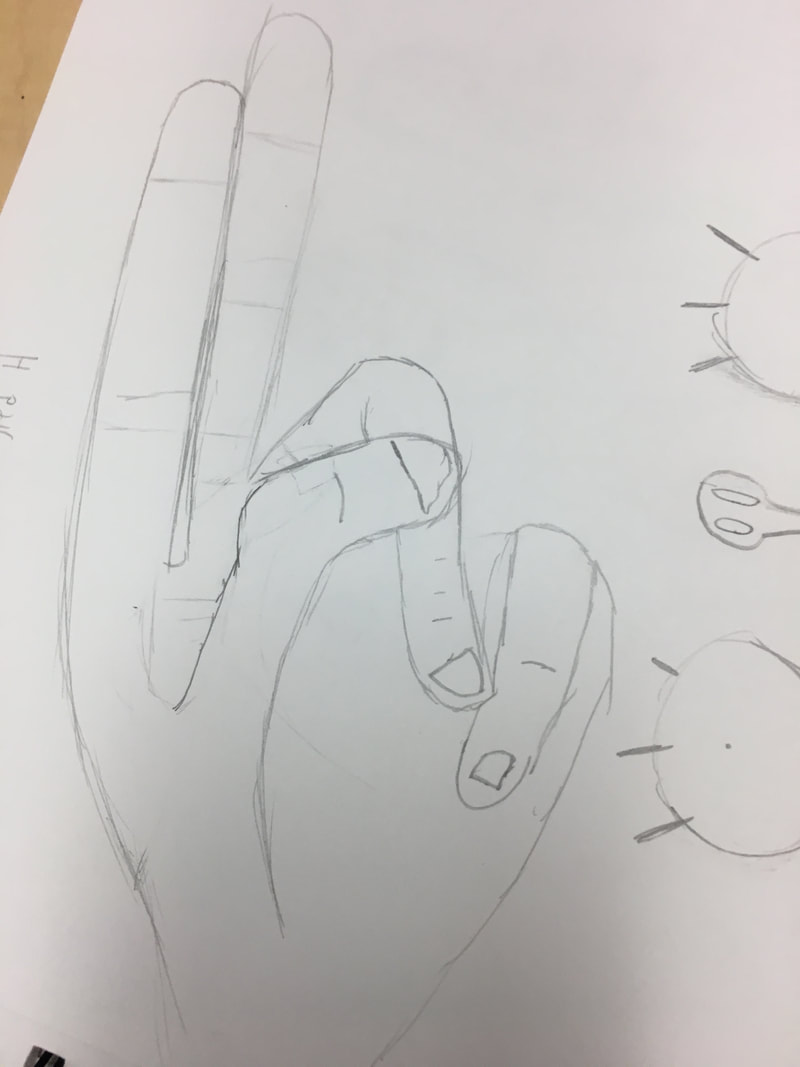
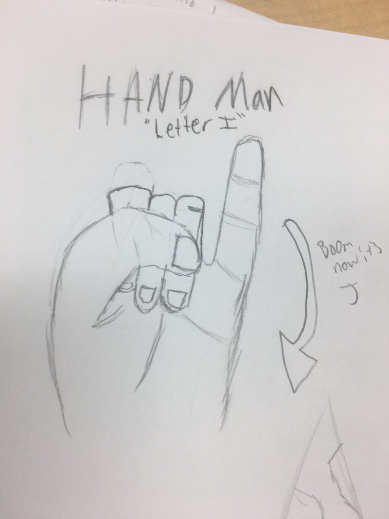
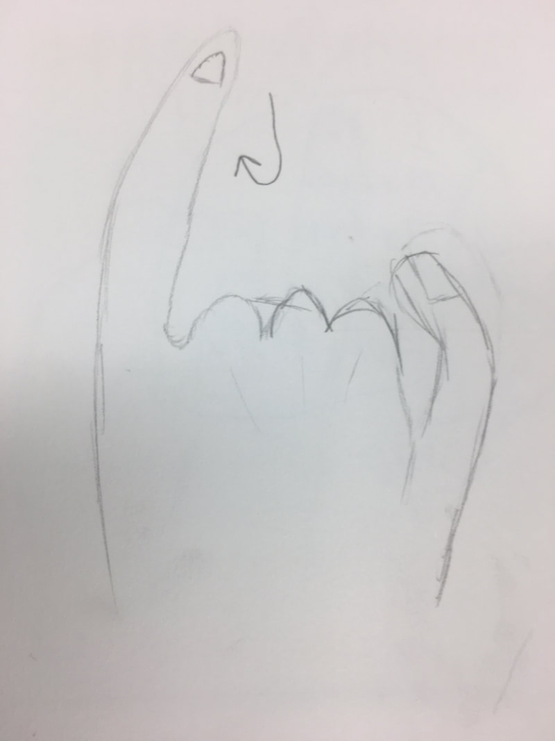
Hi my name is bobby and here are some hands. If you don't like them, nothing you do is perfect and you will never live forever. No one is special we all the same. If you do like the hands I drew, then hey that's really cool! Thanks!
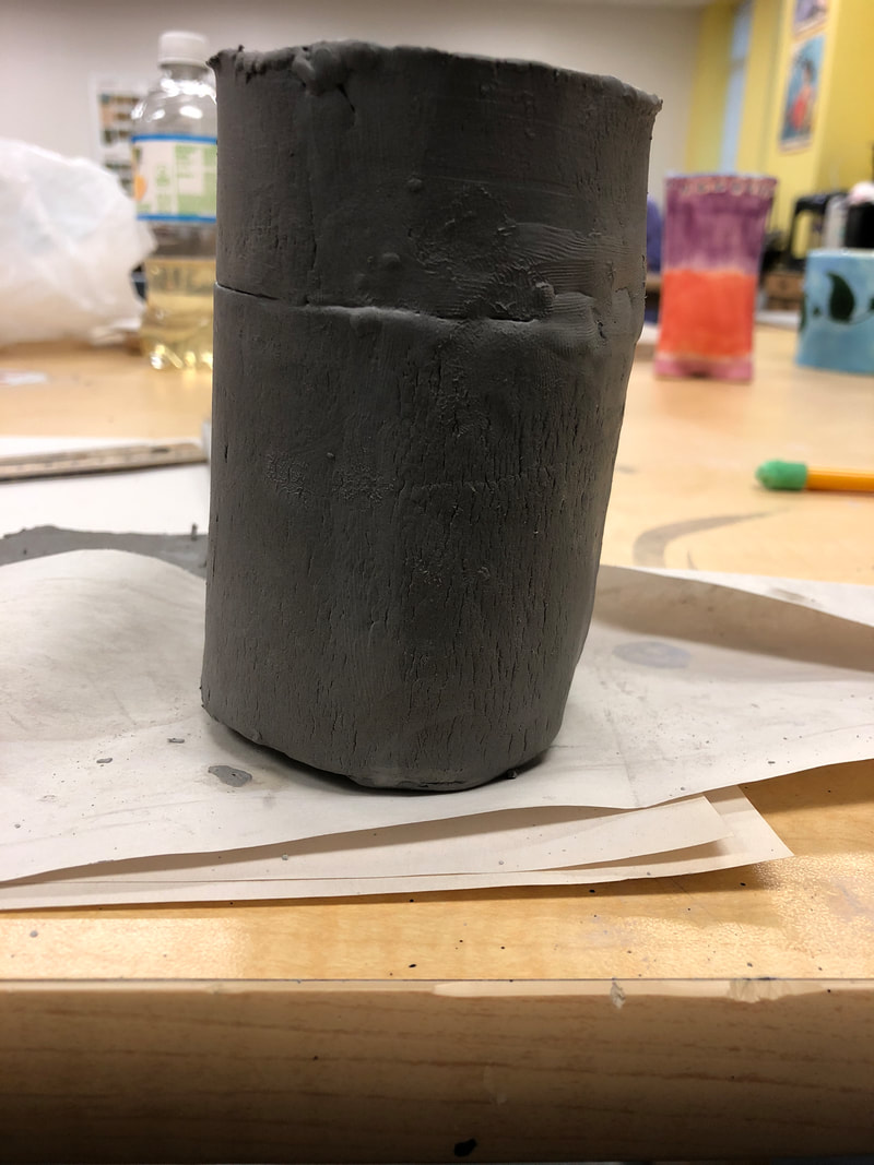 So far, I plan to paint the entire piece red, like a coca-cola can. Then, I plan on making a little ingredients list, so it's a bit more accurate to a Coke can. I intend for the top to come off, but I think I didn't do my measurements correctly. So we will see how that goes.
The most difficult thing for me personally was measuring how much clay I needed and how big I needed to make things. I think I rushed that whole process. Also stacking clay was hard because you can see the crease of where it's been attached. The height and width of the soda can so far as been very good! I'm very pleased with that. If I have one thing that stands out about this, it will probably be that. First I used a slab and made it about soda can width and height. Then I made another, but smaller, stab of clay, scratched and slipped it and put it on top of the original. I then made a small, circular slab and made that my top, making a little soda can ...uh thing with the access clay I had. So far it's going great! Excited to keep working on it!
  1. I really enjoyed that how the paint just kinda does what it wants. It states like, "hey, this can only happen once and it's perfect. Here's a high five."
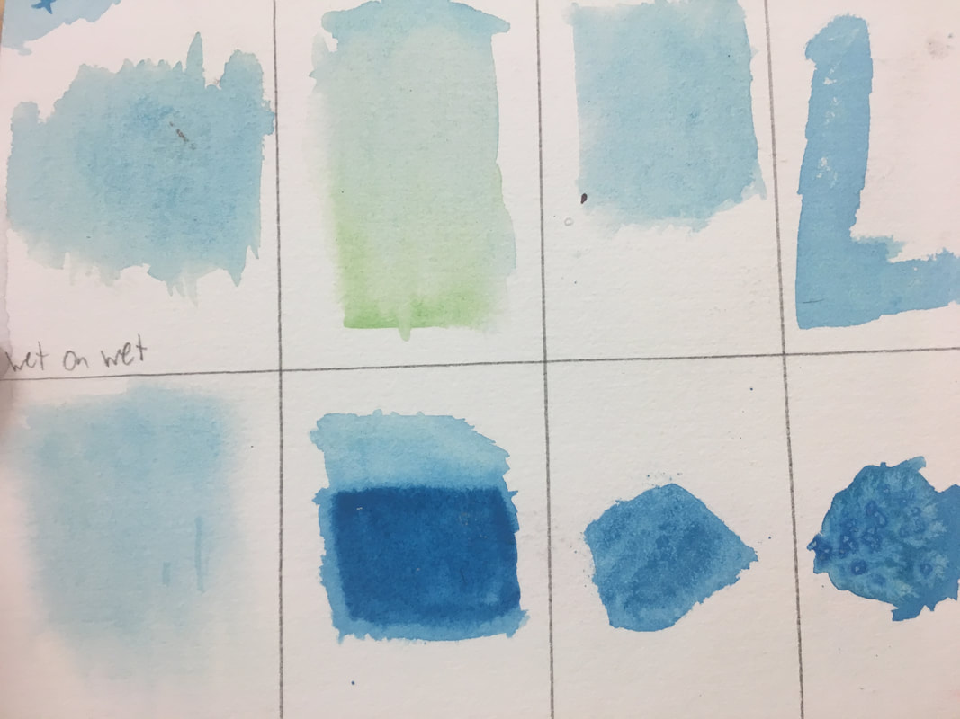
2.I love the look of it. Like the very faded smeared and blurred look; I find it very interesting. 3. What I find difficult is that it's soooo hard to control. You really need to practice with it and understand how to "master" it. Or else it's gonna look very.....okay. 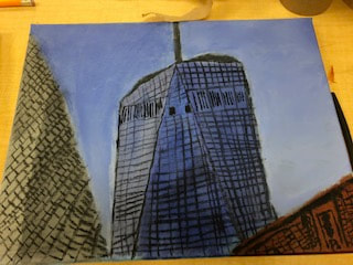 The warm-up that helped me the most was the sphere. It taught me how to blend and put value in a painting.
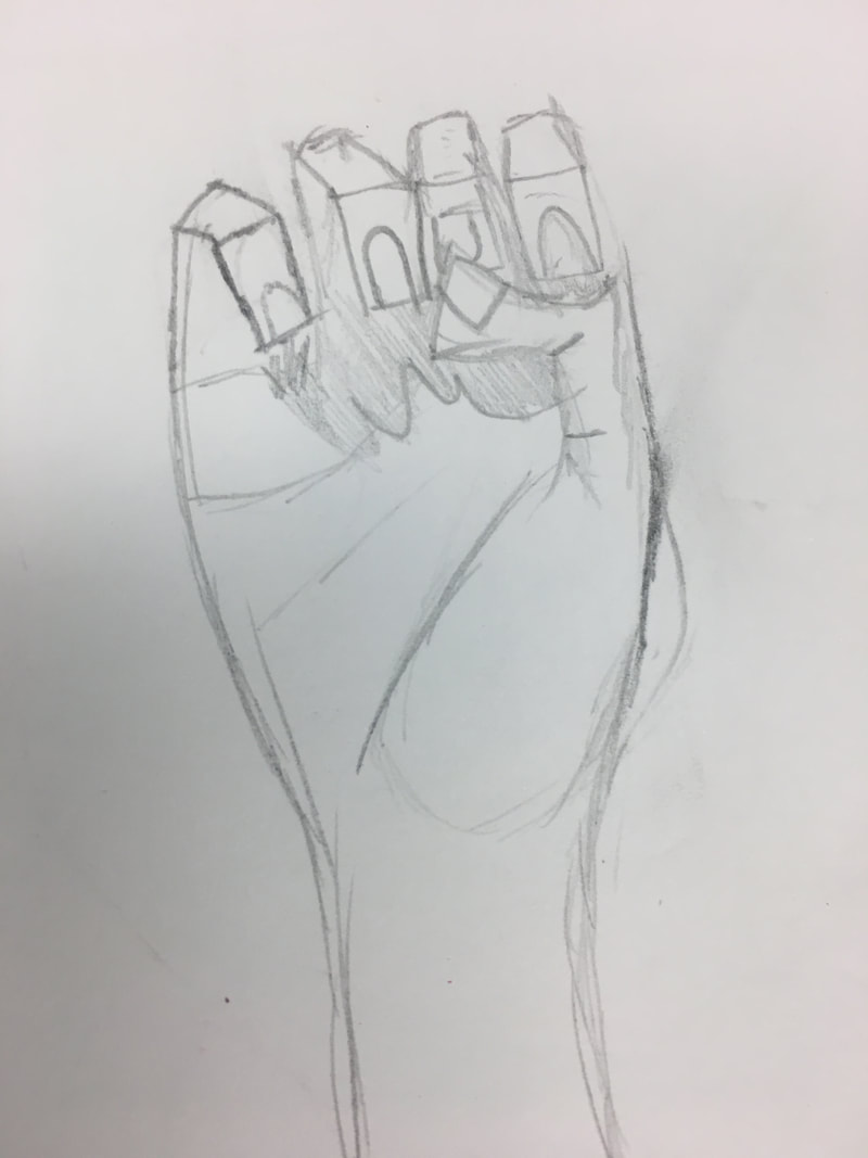
This piece is set to be in New York City. My best friend and I went up for a weekend one time and I took that picture while I was there. It means a lot to me because we bonded a lot that trip!(We found this homeless guy who had a mattress, a pillow and a bag of pretzels. We called him 'The king of homeless people) The most challenging part easily was the tiny black lines that are on all the buildings. For my piece, I used charcoal for the little lines. What was hard was that all the lines got jumbled and confusing. I feel like my piece hits what I was going for. I tried to take on the building not realistically, but more in a way that you can tell it's art. I think at quick glance, it doesn't look too good. But the longer you look at it, you begin to see the Freedom Tower a bit more. I like that a lot about my piece. First, I painted the entire canvas blue. Then, I outlined all the buildings and such. I then added 3 different shades of blue to the Freedom Tower, establishing value to it. I liked the idea of incorporating charcoal, so I made all the lines on the building charcoal! That's all for this piece, folks. The warm up that helped most this unit was easily the sign language drawings. I’ve never looked at hands like that before. How artists look at hands as a variety different shapes is totally a new perspective. Composition- a work of music, literature, or art Value- the relative degree of lightness or darkness of a particular color Charcoal Pros: If you mess up, you can easily fix your mistake. Also, all charcoal pieces look very nice and very unique Cons: Very messy! Kinda ruins erasers a bit Pencil Pros: All drawings are different and unique, you’ll never see the same thing twice. Cons: Value is pretty difficult if you’re new to it! Pen Pros: The shading and drawings always look cool, even if you mess up a bit Cons: If you mess up a bit, you better have messed up in a cool way because the only way to fix it is to restart.  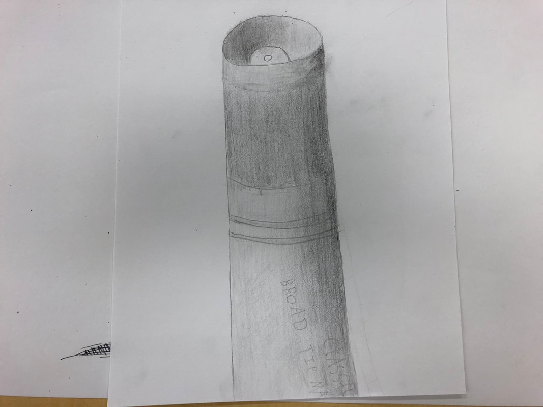  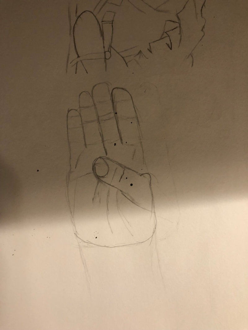 Pierre-Louis Ferrer is a French photographer who captures his pictures in black and white but by only adding one color can show the vivid, living colors of France. Most of his photos are surreal, meaning that they seem almost unreal, even though they are photos that have happened in real time. In most of his photos, he works with the color yellow. I assume he does this because everyone associates yellow with happiness, paradise and other relaxing moods. Ferrer inspires me because he takes a standard photo and turns it into this glorious piece of work just by adding one color to his work. I find it fascinating and one day hope to achieve that level of artistic statement. 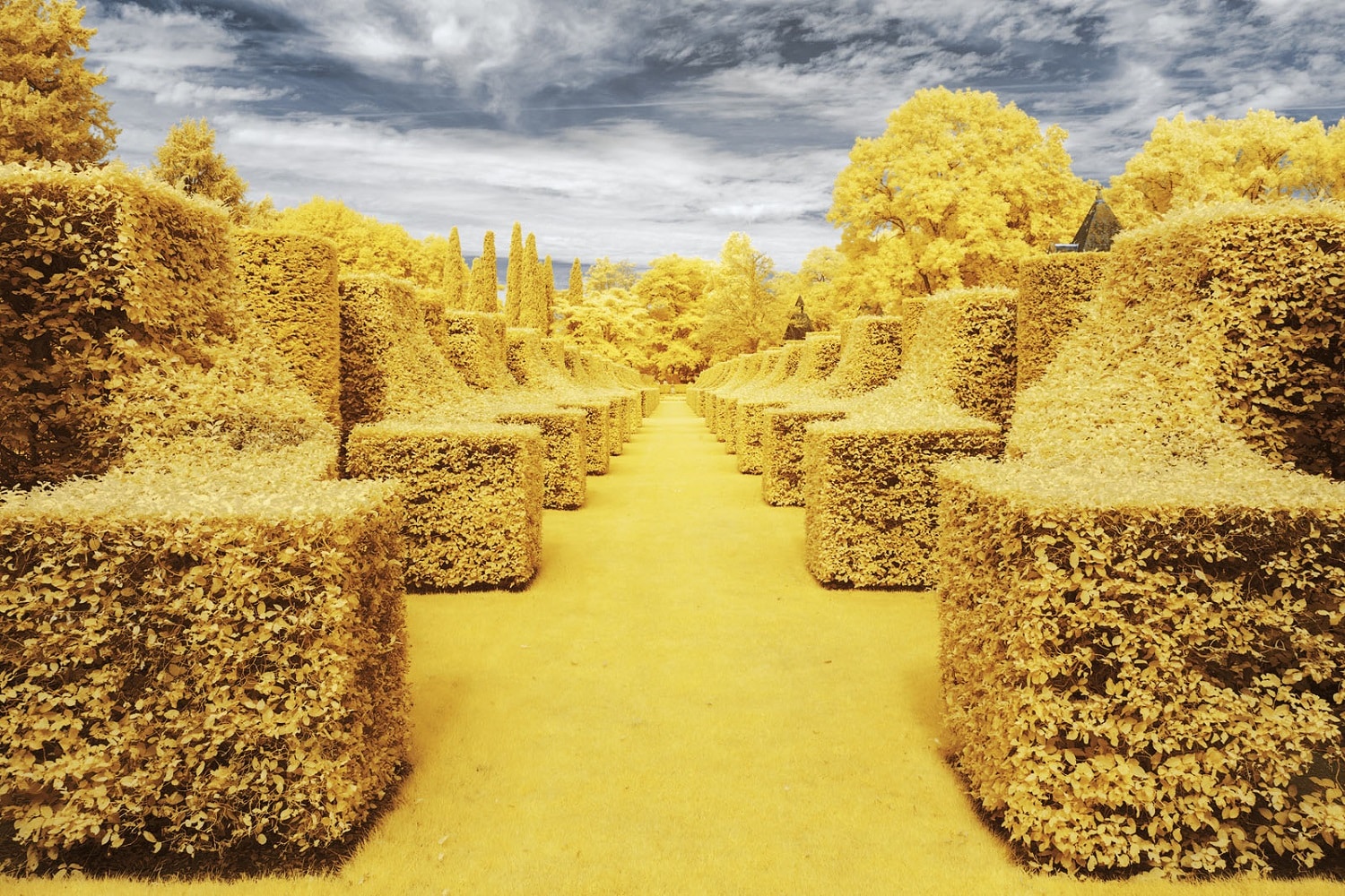 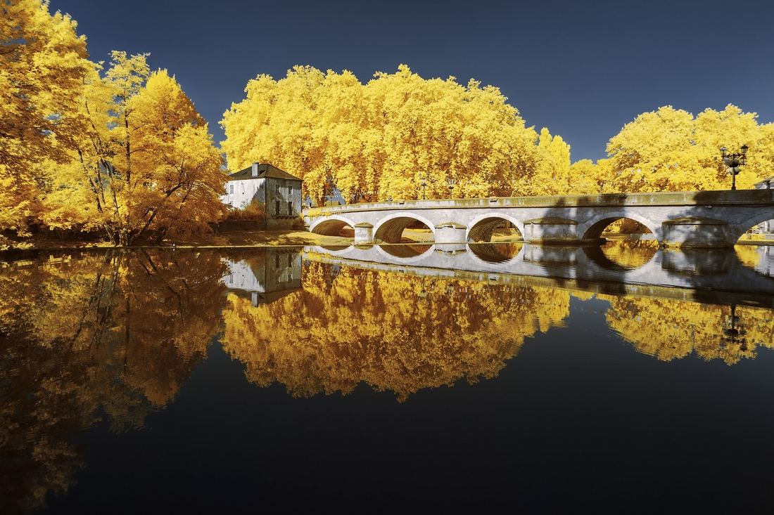 |
 RSS Feed
